Colors play a tremendously important role in graphic design. Do You Know the Significance of colors in Graphic design, Colors have the Significance of creating a mood and evoking an emotional response and rituals from viewers and participants. This is also the best way to convey a message, for example, the color red is often associated with Passion, Love, and danger, while the color green can signify nature, growth, and success. To catch anyone’s attention colors are the most useful design element, such as a logo, UI/UX design, Poster, or headline, and to create a visual hierarchy on the page. Graphic designers must understand the Significance of color and use it intentionally to create effective Powerful designs.

This month the Hindu color festival arrives, In this festival, the main rituals across the world throw Coloured powder (Gulal) with each other to make the bond of loved ones starting in Spring and celebrate new beginnings, Joy, and love. We are going to discuss on this blog Do You Know the Significance of colors in Graphic design holi is inspired by designers who make artwork colorful. Play with color was the meaning of the divine love between Krishna and Radha same as one designer loves his color palette designer is Krishna and colors are like radha.
Significance of colors in Graphic design The red color is mostly used in the Holi festival, but People use more different vibrant colors that reflect the cultural diversity of India and other emotions. In graphic design, we have color psychology of different colors. And signify the designs with color meanings color provide joyfulness in the festival of Holi earlier time people use natural colors at home using flowers, leaves, mud, and other natural substances. But nowadays we have soo many options if you are a graphic designer, you see various design elements in the color festivals. This was the reason why there were lesser colors at that time but each color was used to symbolize a proper meaning. And playing with these colors still holds a lot of significance.
In this Holi festival with the help of graphic design Let us understand what each color stands for and understand its significance.
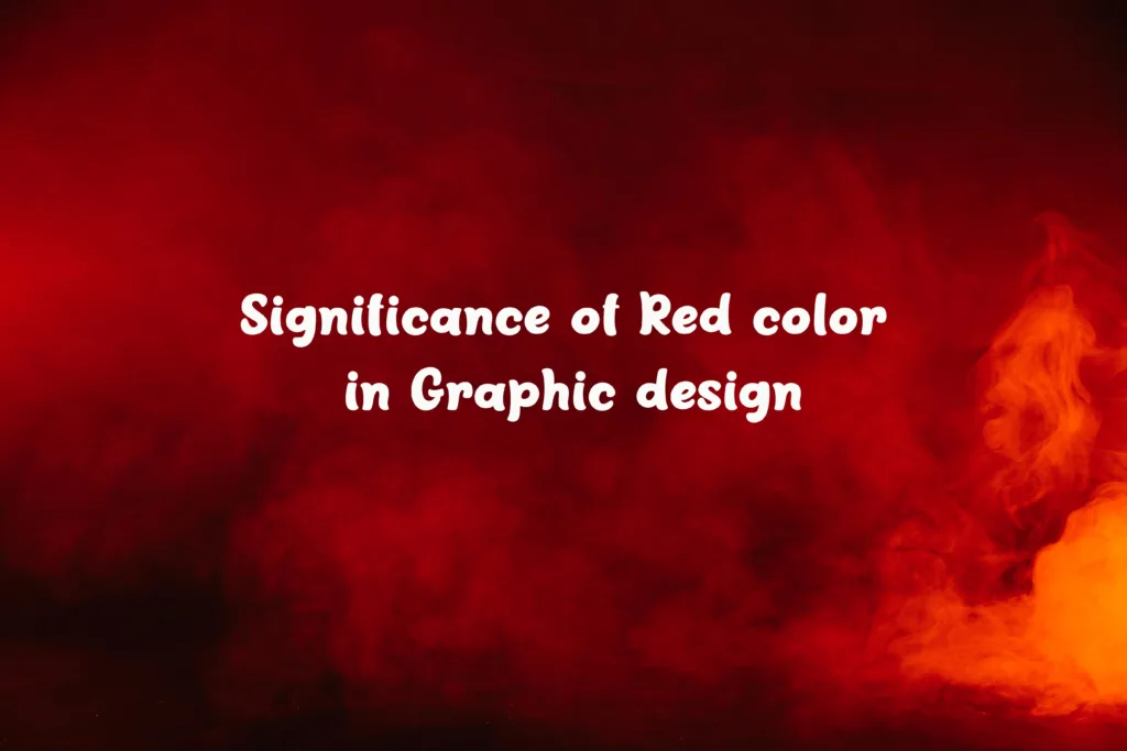
The red color is a wide and important color in Holi festivals and in graphic design red color is used for bold design this color symbolizes Passion, love, weddings, and fertility.
In graphic design, Significance of colors in Graphic design incredibly powerful color in the world is Red. It can also be used to convey urgency or to portray attention to important pieces of inspiration. in a design red color is a great accent. In terms of branding and logo design, red is a great choice for businesses that want to stand out from the competition. It’s a bold color that suggests confidence and can make your logo more memorable. For example, Coca-Cola and Target both use bright red in their logos. in promotional emails, red color is, highlighted in the “call to action” button This encourages people or users to take action quickly it’s a great example of Ui/Ux Design. in print designs, red works well, and eye-catching colors create a sense of drama. This color is visually appealing making any low design vibrant style. Overall, red is a great color to use in graphic design.
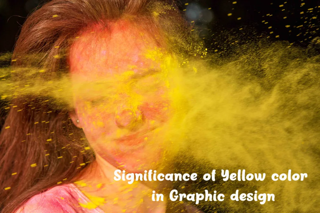
Significance of colors in Graphic design strarts with Happiness-inducing color Yellow. It is widely used in the Festival of Holi. Since ancient times, this color was made with turmeric powder. But nowadays people use the most frequently yellow colors. The significance of the yellow color is happiness and good health. In Hindu mythology, yellow is the color of Lord Vishnu (Hindu God). The color is also known to depict knowledge, learning, peace, and joy. And you should definitely play with this color during Holi, yellow is extracted from natural resources turmeric in India, which has great medicinal Properties it is also an auspicious spice used in weddings and worshiping Rituals
Yellow also has a bright and cheerful vibe, which can be used to create a warm and inviting atmosphere. Its versatility makes it a great choice for a variety of design styles, from bold and modern to subtle and classic.
In terms of visual design, yellow is associated with optimism and energy. It’s often used to highlight important elements in a design, like headlines, buttons, and text. It can also be used to create contrast and visual interest in a design. The vibrant hue can also evoke a feeling of joy and enthusiasm, making it a great choice for branding and advertising.
When used in moderation, yellow can also create a sense of harmony and balance in a design. It can be used to create a subtle backdrop and provide a sense of calmness. The color can also be used as a way to add visual interest to a design without being too bold or intrusive.
Overall, yellow is a versatile color with a wide range of applications in graphic design. From creating contrast and visual interest to conveying optimism and energy, it can be a great choice for a variety of design projects and have strong Significance of colors in Graphic design.
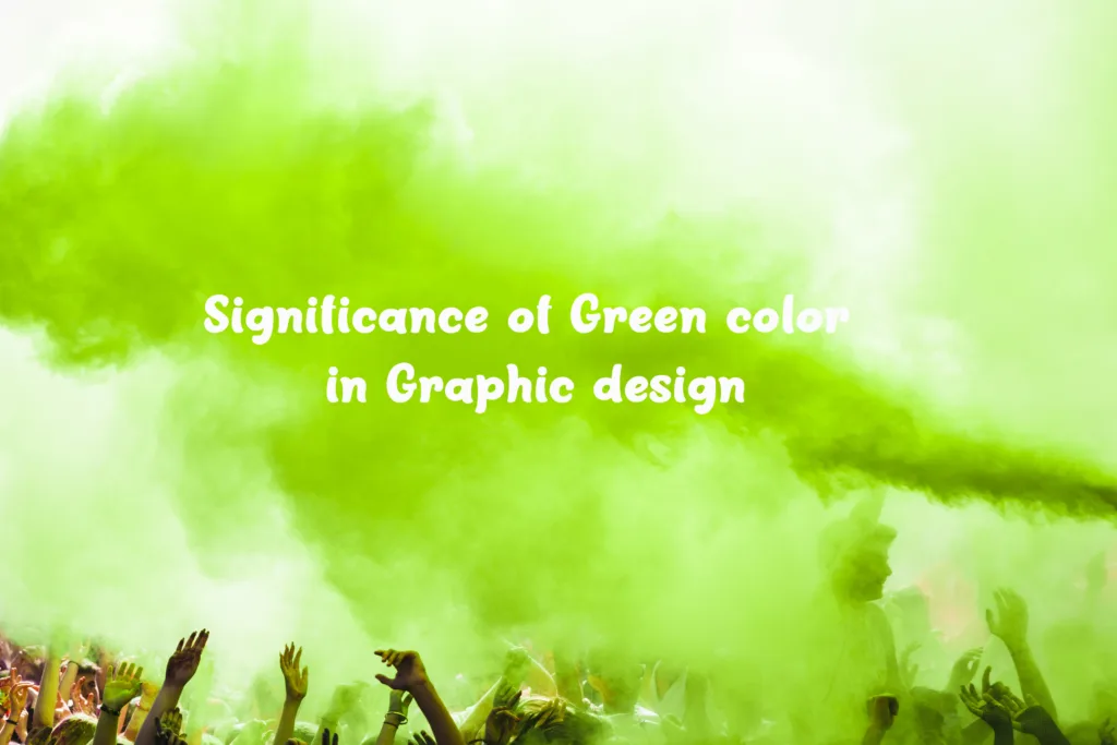
Naturally, obtained color is Green it is extracted from spinach. Refresh the people in Holi with this Green color. The green color in holi is the significance of color in graphic design and people’s life it’s a new beginning, harvests, freshness, and virility. manifestation of the divine in Hinduism the Green symbolizes nature. It is a happy festive color. Green is used in many color Festivals around the world. If you want to about which festival Read this Post
10 Colourful Festivals inspired Graphic Designers to Visit
Green is often used in graphic design to create a sense of calmness and serenity and sensations of green can be evoked In nature Green can be used to create a cool, calming color palette, contrast, and depth to a design. It has a sense of energy and vibrancy, depending on the shade and intensity used.
Significance of colors in Graphic Design Green colors In logo designs – to represent a business’ commitment to sustainability and the environment. This is especially true for businesses that specialize in eco-friendly products and services. Green can also be used to create a sense of trust and reliability, as it is often associated with money and stability in many cultures.
Designers consider Green a great choice of color for an overall design palette. It blends with any color and can be used to enhance a design’s bold look Green can also be used to create a sense of balance and harmony when paired with other colors or to provide contrast in a design. Green is the perfect choice for any designer looking to create a tranquil, refreshing, and uplifting atmosphere.

Purple is the color of magic and mystery. and blue is for trust It is the color of new possibilities. It’s calming and soothing. These colors make you relax It is also one of the most widely used colors in the Natural Dye Process and ties & dyes its extracted from red cabbage pigment at home. Blue is the color of the sky and ocean and its significance is calm and serenity. Lord shiva has his skin color is Blue. in Indian culture it’s a symbol of immortality, bravery, and determination.
In graphic design, Significance of colors in Graphic design Blue is a very powerful color. It can create a sense of calm, stability, and trust. In Graphic design, Designers are frequently used this in making corporate logos to convey a sense of reliability and dependability. Blue makes the environment fresh and youthful. In web design, blue is often used to create a sense of trust and reliability. You see this color in a professional atmosphere. in Print Media blue color materials are used to draw power and prestige. Blue can also be used to create a sense of depth and space, making it ideal for Architectural Design and wall backgrounds in large areas of a design. Blue can be used to bring a design to life.
Purple is a versatile color that is often used in graphic design. This color has design significance to use to create a sense of royalty, luxury, and sophistication. Its generated feelings of creativity, imagination, and mystery. The various shades of purple are used for calming and tranquil atmosphere. In addition, purple can be used to create a dramatic and eye-catching effect.
When it comes to the design industry – graphics design, purple focuses to draw attention to certain elements in a design. It can also be used to create a cohesive and unified look.
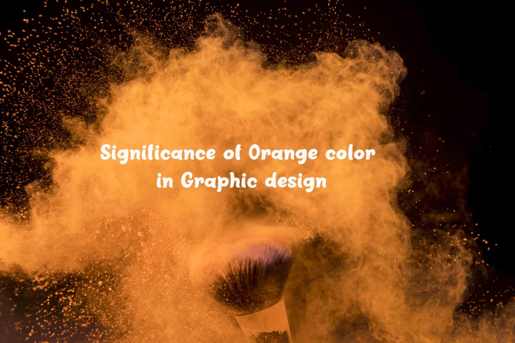
Orange is another color that is super special and can energize your life instantly which we absolutely love it. This color is the significance of new light born with our sun. This color is to leave the past and move forward. This color is also known as progressive and forgiveness to start afresh again. Orange (dark saffron) is the color of The yogis, gurus, and ‘men of God’ wearing saffron robes paired with bright saffron safa’s. its most dominant sacred color in India. Most research of Graphic designers on color psychology says In Hinduism, the orange significance of the sacral chakra (‘energy center’) — is the self-center. Orange (dark saffron) in the Indian these facts is shows Significance of colors in Graphic design.
Orange is in design color psychology an incredibly versatile color in graphic design. Its significant nature is induced emotions of enthusiasm, warmth, and energy. Orange is also great for creating a sense of energy and excitement, making it popular for logos, signs, and branding. Most popular food brands use the orange color to associate with hunger. It also pairs well with other colors and can be used to create a striking color palette. When used in moderation, orange can be an incredibly powerful tool for graphic designers. For a unique and vibrant look to your work use this color in your design Projects.

People love this color the most because this is the color of LOVE and CARE. positivity and kindness are symbols of this color. Pink is generally extracted from beetroot naturally this color also tells us about fun, and the significance of color in graphic design has certain meanings Feminine pink is an innocent, cheerful color that symbolizes youth, good health, and playfulness. Pink is give joy and energy to Holi celebrations.
Significance of colors in Graphic design, Pink color is create a warm, inviting feeling of affection, joy, and positivity. Pink can be used in all sorts of creative ways, from creating backgrounds to highlighting sections of text. It’s mostly used as a minimalistic design, as it stands out against a lighter background. Additionally, pink is commonly used to denote femininity, making it a great choice for designs targeting female audiences. Most female and kids brands’ color pallet is full of pink shades Moreover, pink can be used to create a luxurious and high-end feel, as it often conveys a sense of sophistication. In web design, this color makes a heavy theme into a lighter look and feel of website design and is less used in Print media.
Holi is also known as Happiness and the joyfulness of the festival. White and black are not used in Holi’s joyous celebrations. And also in graphic design black and white color is not make the design vibrant but this is used in the support of other colors.
White: For funerals and ceremonies white is mainly used that mark death in the family, and it is the color that widows must wear.
Black: Black is connected with dark desires, evil, negativity, and inertia in India. It always appears as a representation of evil when warding off evil.
But in Graphic & UI/UX Design, designers use color according to user research data for making their user experience better but holi festive vibes can change users’ and design perspectives so they think of more colors in Design Projects.
Using colors in graphic design can be an incredibly powerful tool to convey emotion and make a statement. The significance of colors in graphic design can evoke feelings, draw attention, and create an overall atmosphere. All color depends on the first source of color in the world is nature. For example, colors like red and orange are often used to create an energetic and exciting feeling, while colors like green and blue can create a calming and peaceful atmosphere. Additionally, colors can also be used to create contrast, allowing different elements to stand out from each other. Graphic designers are very inspired by the festival of Holi they feel like the whole world is the canvas to draw colors of life and also professionally they learn lots of things with the holi festival. Finally, colors can help reinforce brand identity, as specific colors are often associated with certain companies and organizations. Overall, colors can be a great way to add emotion and depth to graphic design work.


Very interesting post
this blog is great for design learnings suggest any design college for getting design degree course
Great understanding of colors we love this information
greate content
i enjoyed this festival on india,your content good with information.
we love to play with colors
i know its indian Festival
i like your content can you provide more information about other design topics on branding
good
rgb colors are good for cards?
nice
valuble info of colors
good
i know this festival good information
post regular i like your content
Great learning in design
hello we need to see some fashion designing content you give us good knowledge
Designthinkingblogs – is good blog for design learning
Hello guys! Good article Designthinkingblogs – World’s Best Design Blog
we love your blog
good content on this site
learnings are good
wonderful knowledge
good content
is this festival?
nicely info
colors are mood dependent