Yay for all the festivals! Christmas is approaching, and we are eager to spend the holidays with our families, friends, colleagues, and loved ones, so everyone is looking for ways to make Christmas memorable through outstanding themes now I am sharing a few Tips for Christmas Graphic Design and the use of graphic elements that enhance the visual aesthetics of the day’s themes this is great tips for Christmas Graphic Design.
As a result, when creating themes and Tips for Christmas graphic design, some important factors must be considered, some of which are listed below.
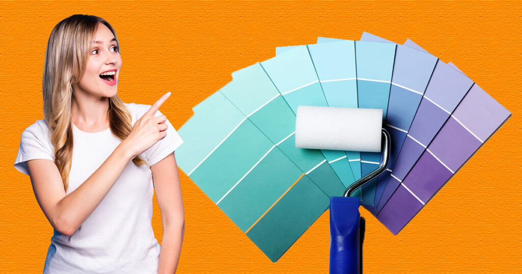
Three colours are used in Christmas themes: red, green, and white.
RED: Positive connections include fervour, intense feelings, enthusiasm, affection, assurance, comfort, and warmth.
Danger, rage, violence, fire, and battle are all negative associations.
Bright red is used in designs as an accent colour, and dark red is frequently used with grey and white for a polished, professional appearance.
Santa’s clothes are red and white.
GREEN: nature, growth, health, fresh starts, money, rejuvenation, peace, abundance, calming, fertility, great fortune, harmony, and balance are all positive connections.
Negative connections include lack of experience, avarice, envy, and jealousy.
Olive greens are most frequently used to symbolise the natural world; darker greens are better to denote wealth and security; and brighter greens are rapidly used for lively, stimulating designs.
WHITE: Cleanliness, marriage, virginity, healthcare, purity, goodness, and peace have positive connotations.
Cold, dreary, bland, impersonal, uninspiring, and antiseptic are some negative senses.
Generally, design applications for white include serving as a background to make other colours stand out, supporting minimalism, and conveying the winter season.
Apart from this, you can experiment with different colours like silver and sea green, and a sky blue is a good option for colours. in Graphic design, we use colour psychology to make our design powerful for stakeholders, users and clients.
Graphic design is communication through any design elements like images, lines, dots, circles and typography, it’s a visual communication with creative ideas and messages. people doing graphic design is graphic designers or visual designer. they are helping us with amazing tips for Christmas Graphic Design. Some Designers doing great jobs in graphic Design and getting the title of best graphic design work.
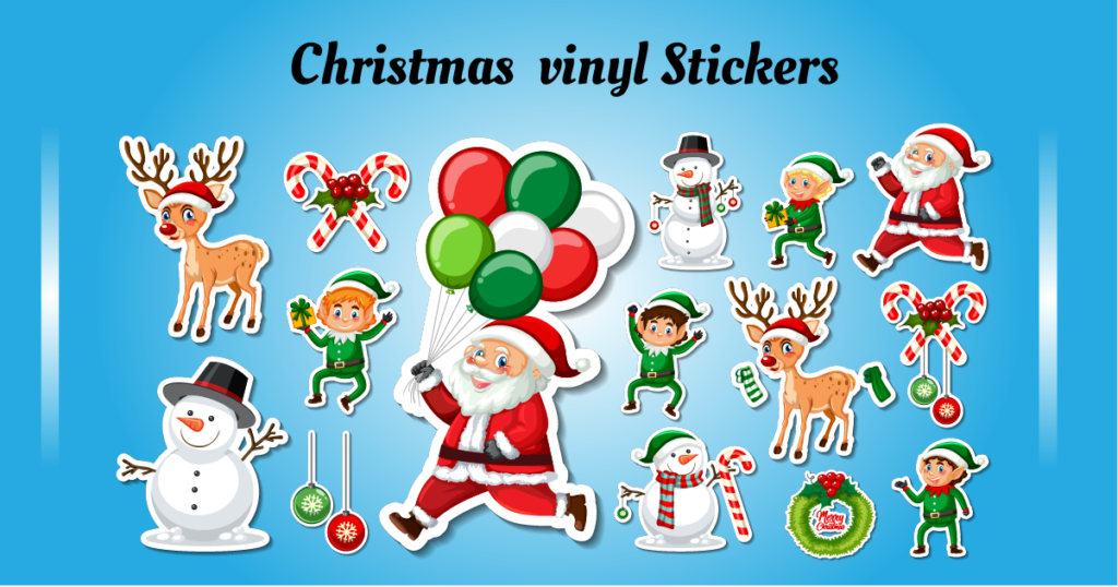
Vector graphics are artificial intelligence (AI) and computer-generated commands, codes, and sequences. These images are solid in colour and have high visual quality because they are generated by mathematical calculations and formulas and placed into two-dimensional (2D) images. Most graphic designers used these images to create high-end graphics; vector images are great for printing and making vector cutouts.
Vinyl stickers are printed on PVC material, which is a white sheet that is rugged, durable, and strong, and they are available in a variety of colours; using these stickers is the best graphic design tip for Christmas.
So if you use a great design for vector graphics cutouts, your themes will look very premium and visually appealing. Most parties use stickers for decorations because they’re easy to create and can be customised according to your needs. If you want to showcase your stunning visuals, I recommend that you design your cutouts and stickers with the assistance of professional graphic designers its the Tips for Christmas Graphic Design. The best software for sticker design is Adobe Photoshop and Adobe Illustrator.
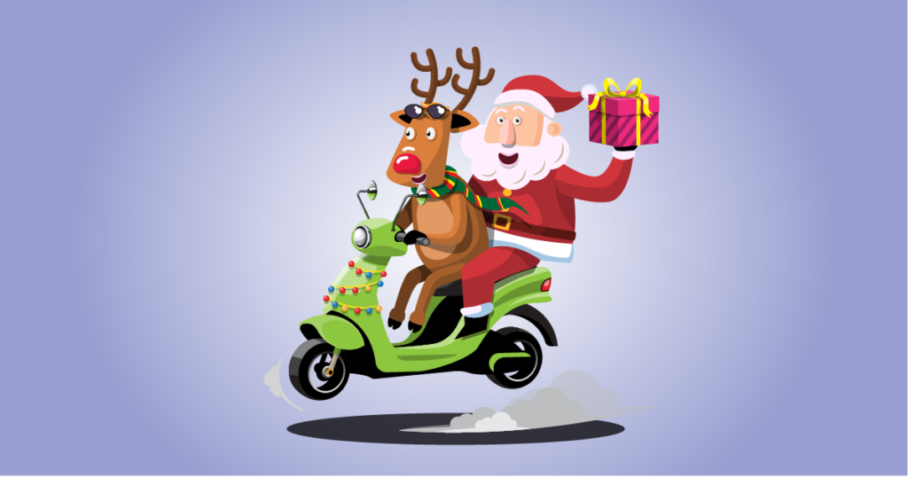
Imagine being able to play with reindeer alongside Santa at Christmas.
Yes, we need it because every time it’s just Santa on Christmas Day, it’s very good to see other Christmas characters play with us…
Mascot: A mascot is an identity of any firm or organization; it is in the form of a fictional character, animal, person, or any object that is believed to bring good luck and is also representative of festivals and events.
Both the organization’s identity and logo are effective for business, but the mascot adds the value of people and cultural belonging to the organisation or event.
Adding some live characters on Christmas Day is a great idea from a design standpoint because we can easily symbolise our theme, and it’s a great opportunity to create a graphic design for the mascot and characters. A mascot is used for branding, and here, Christmas itself is the brand. A mascot attracts attention and creates a social presence. Making a mascot is super easy. The cheapest building material is cardboard boxes, and you can upcycle your old clothes as well include this effective Tips for Christmas Graphic Design.
for more you want to know characters see this Article >>>

Typography is one of the most important aspects of the design process. With the right font and typeface, any marketing material or digital advertisement can be meaningful and best Tips for Christmas Graphic Design. It is a very strong graphic element in graphic design. A good Christmas theme has great typography or fancy fonts, and typography has been used since ancient times. After digitalization, it is the soul of any theme or design. Typography is booming, and modern typography is well connected with the digital and print worlds. Let’s know the typography.
Typography is the arrangement of letters, alphabets, and text in such a manner that it makes any design, theme, or brand name more apprehensible and visually appealing to the users.
two main elements of typography Typefaces and Fonts
There are two types of typefaces: sans-serif and serif.
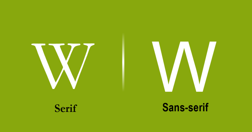
The term “sans” comes from France. Sans means “without,” so when a font has no features or strokes, it is called a “sans serif.” These typefaces were created in early 1805 for printing purposes because they look very clean and are visible and detailed. Some famous sans-serif fonts include Monserrat, Arial, Tahoma, and Helvetica, among others.
Serifs are strokes or structures attached to the edge of a font. There are several theories about the origin of serif typefaces, but here is the most reliable one: during the Roman era, Latin letters were carved into stones, and the artist followed and painted the letter outline on the stones. When the carver followed the outlines at the end of the alphabet strokes of the brush, this stroke was formed and is known as a serif. This typeface is mostly used in the publishing industry, like newspapers, magazines, and books, because serif typefaces are beautiful and readable. Some sans-serif typefaces are called New Roman, Garamond, and Georgia.
With many years of design practice and experience, my general recommendation is for anyone who uses any font, typeface, or letter to convey a proper message based on the context of the project or themes. using this is also enhanced your Tips for Christmas Graphic Design.
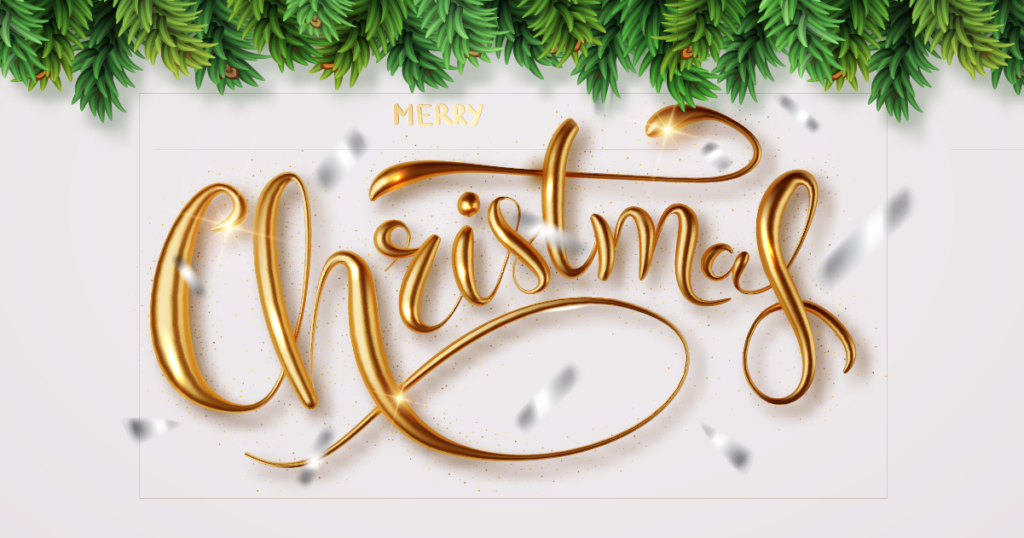
Make your metal themes bold, hard, and sharp. This is a great opportunity for metal artisans who love to do creative things with metal. You can design some Christmas elements using metal. It’s up to you; some people use gold and silver, and some of them use iron and other metallic materials. Designers use design thinking to create this metallic effect with fewer efforts and the cheapest technology. Creating Christmas props with metal is one option, as is using metallic spray paint on plastic toys or Christmas mascots to achieve the texture and shape of metal with the help of metal casting.
the phenomenon of creating objects or props by spewing molten metal into an empty-shaped frame and space. It’s a cheaper process than creating real metal pieces.
Nowadays, people believe that in the digital world, it is an effective way to get the effect you want for your themes. The best graphic designer is designing the themes using the design thinking process, and in design software, they will make metallic effects. Also, gold and silver foil for packaging are good options for presenting yourself as luxurious and affluent. Adobe Illustrator and Adobe Figma are the best software for creating metallic effects in a few settings. So go hard with metal.
Motion graphics and animation are a modern version of a stage play that also resembles a puppet show. Animation makes the euphoric holiday season more engaging with motion graphics. Still, graphics are old-fashioned. The new world needs moving illustrations for the Christmas theme. If you used motion graphics to highlight the object, we want to animate it. Let’s comprehend the meaning and difference between motion graphics and animation.
Motion graphics is the art of putting static illustrations and graphic elements into motion using professional software like Adobe After Effects, Cinema 4D, and Final Cut Pro. It is a way of communicating by adding text motions and other components like lines, circles, and many more. The use of motion graphics deepens themes. Motion graphics is a type of animation and falls under the category of animation.
The motion created by a back-to-back sequence of pictures or drawings is known as “animation.” It is a simulation-type thing. According to studies, human eyes can retain lump sums of one-tenth of an image per second, and our brains blend into a single clip. These days, all animations are made with computer-generated images (CGI). There are two types of animation: traditional animation and modern animation.
Adding animation to our Christmas themes is best Tips for Christmas Graphic Design becouse of this your theme looks live and attractive.
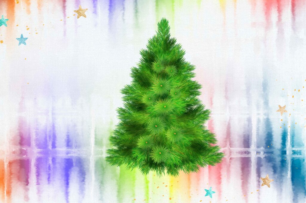
This is a unique way to deal with fabrics in Christmas themes, and it also looks very beautiful with shades of colours and textures. It is a very easy technique that anyone can DIY, and it’s also famous among fashion designers in terms of fabric manipulation. and the perfect example of a design thinking process. a few tie-and-dye procedures, for example:
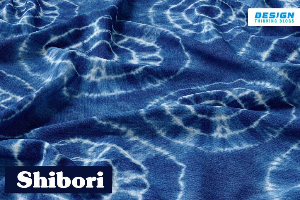
It is the resist-dye textile technique. Shibori is a Japanese term; in Japan, shibori means “wrings,” where “wringing” is squeezing any object to remove water. It is made by folding, twisting, and binding fabrics and designing great textures.
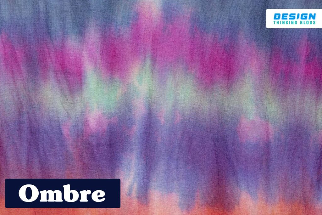
The dipping dye effect of dying fabric is the ombre technique. Because ombre is a French word that means shade, we must use the ombre technique to create a shaded effect on the fabric. With a Christmas theme, it will look incredible.
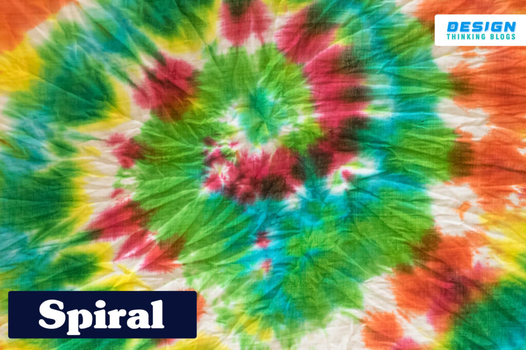
This is the easiest and most impressive technique of tie-dye. It’s also known as the swirl dye technique. A spiral of texture created at the centre of the fabric and tied with thread or a band and then dyed is the most effective way to design psychedelic texture, and with this technique, you can make your Christmas theme psychedelic. These are the most common in t-shirt design.
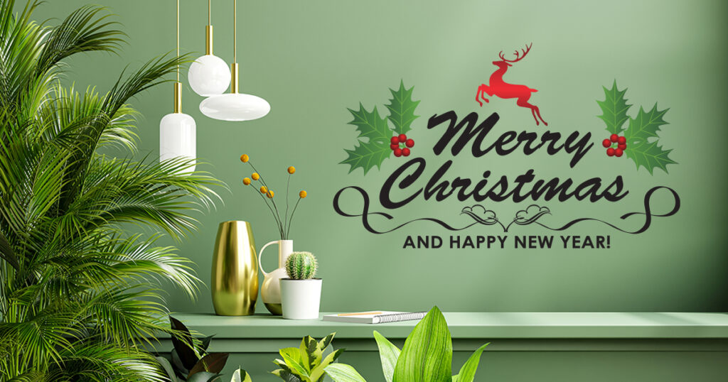
“Green Christmas” is green in colour. We are not forgetting Mother Nature this Christmas by consuming zero-waste products. We use eco-friendly materials in our Christmas themes, and graphic designers and fashion designers have the best opportunity to collaborate and make Christmas wonderful while protecting our planet Earth. The World Wildlife Fund, Inc. (WWF) also raises awareness during the holiday season about some of the simple ways and great Tips for Christmas Graphic Design to make our Christmas themes more environmentally friendly. Prefer intangible gifts instead of tangible ones: Tangible gifts are anything we give you that you can touch and feel, like favourite products, objects, or materials. It could be anything. It is not an environmentally friendly approach. Intangible gifts are ones that you can’t touch and feel physically, but they can be experiences that we share with our loved ones. This Christmas theme is purely chosen for natural places, which means your favourite places. Old is gold: If you aren’t afraid of judging people in the festive season, old is gold for you, which means you can use your old stuff at Christmas to save nature. You can make graphic elements with some old things like old packaging, old clothes, and cardboard. If you love doing graphic design, then you make gorgeous themes with old stuff.
So your festive season and Christmas holidays are special if you make your own themes with a considerable amount of colours, fonts, affordability, uniqueness, motion, textures, and most importantly, Eco Friendly.
These things also apply to Tips for Christmas Graphic Design in theme design. Always connect with us on our blog, where we provide you with the right direction for making your graphic elements.
Answer: Design elements are the foundation of any design; every design is created by combining seven elements: colour, space, form, line, value, and texture (SCSFLVT). Designers always create with these seven design elements in mind.
2. How can I make my graphic design better?
Answer: If you want your graphic design to be world-beating, you have to follow the Principles of Graphic Design. If you just start in graphic design, you need to know some of the basics, but if you’re a professional graphic designer and want to upgrade yourself, it’s better to take some level-up courses in graphic design.
3. What makes a strong graphic designer?
Answer: Graphic designers must be creative and have a good sense of visual design, as well as have problem-solving skills and the patience to deal with criticism.
That means you’ll lead some stylish features and design theme great knowledge on design