Background Design has Latest 8 Background Design Techniques in UI/UX Design, every Design is designed in base structure background design is known as the solid colors, Gradients, or images that influence how users experience the particular Design or idea. having a well-versed conceptualized background makes it UI/UX design more appealing and meaningful to viewers or Users. The background is a backbone for designs and an essential element in the composition of Ui design. The UI design serves as the root of creative design with users’ perspective and making necessary components in a Background design is to enable the graphics, shapes, alignment, and aesthetics to deliver a suitable message to Users.
For backgrounds, we use high-fidelity vectors and images according to the Latest UI design trends in 2023, with all emphasis on making responsive App and website UI designs. image and vector backgrounds are quite effective at creating the User interface and giving Users a preliminary look at what the website and application are about Provide.
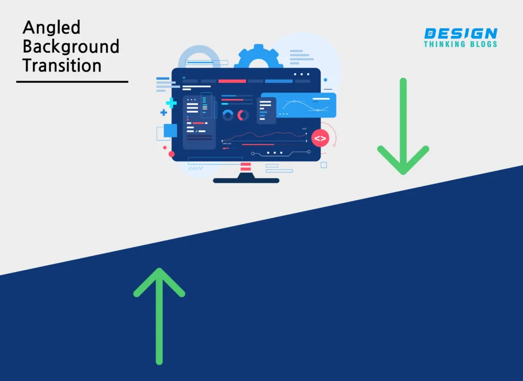
An Angled background transition is a great background design technique that involves using solid colors, gradients, or patterns to create a diagonal transition diagonal means one side of the background is bent between two sections of a design. This method can be applied to a range of design forms, from webpages to mobile applications and physical materials. The angled background transition technique creates a seamless transition between two sections of a design, creating a sense of flow and continuity. This technique serves to construct an invigorating and appealing layout, captivating the user’s focus while directing them through the material. There are various ways to implement angled background transitions in a design. A gradient can be utilized to seamlessly transition between two colors, sloping diagonally across the space. For example, a website may have a blue gradient background design that transitions to a green gradient background at a diagonal angle, separating two sections of content.
Another way to implement angled background Design transitions is to use a pattern that transitions diagonally between two sections of a design. The pattern can be anything from simple doodles, and geometric shapes to complex illustrations. Let’s know with the example, a mobile app may have a patterned background that transitions diagonally between the home screen and a settings menu. It makes UI design User-friendly and Using angled background transitions can also help create a sense of hierarchy in a design. By using different colors or patterns in different sections, designers can highlight important information or call to action, guiding the user’s attention where it’s needed most. It’s very beneficial for Developers to work on developing software and product design services. Overall, angled background transitions are an effective design technique that can add visual interest and create a seamless flow in a design. Employing this approach can enable designers and developers to produce vibrant and captivating user interfaces in any form of design. When implemented correctly, angled background design transitions can help to elevate a design and make it stand out from the competition.
A curved Background Design transition is a visual effect in a UI Design that creates a smooth transition between two different backgrounds on a website or in a graphic design. Instead of a sharp line or edge between two backgrounds, a curved transition creates a more organic and flowing smooth visual experience. To create a curved background design transition, designers often use a gradient or a series of gradient colors that blend together to create a seamless effect. The gradient can be adjusted according to the layout and its effect desired – in horizontal, vertical, or diagonal directions. Another technique for creating a curved background transition is to use a mask or a shape layer to create a curved edge. By placing the shape layer over the two different backgrounds and adjusting the opacity and blend modes, the designer can create a smooth transition between the two. And if you working on figma software you can use plugins to save your time. Curved backgrounds can add a unique and attractive visual element to a design. Smooth and curved forms can bring a sensation of progress and activity that is both pleasing and dynamic to the visual senses. a curved background Design transition can add depth and interest to a design and create a more immersive and engaging user experience.

In UI/UX design, the term “Tilted Highlight Shape” is used, as it is a makeup technique. However, the concept of highlighting and creating a sense of depth and dimension is relevant to UI/UX design. In UI/UX design, designers often use lighting and shading effects to create a sense of depth and hierarchy. The use of background highlights and shadows creates eye-catchy UI elements on a design while creating a more immersive and engaging user experience. One example of using highlights and shadows in UI/UX design is the “Material Design” style popularized by Google. This design language emphasizes the use of shadow and light to create a sense of depth and hierarchy. In Material Design, elements are given a “z-depth” value that determines their position in the visual hierarchy, with higher values appearing closer to the user.
Overall, while the concept of a “Tilted Highlight Shape” is not directly relevant to UI/UX design, the use of highlighting and shading to create a sense of depth and hierarchy is an important part of effective design in this field and use background design effectively.
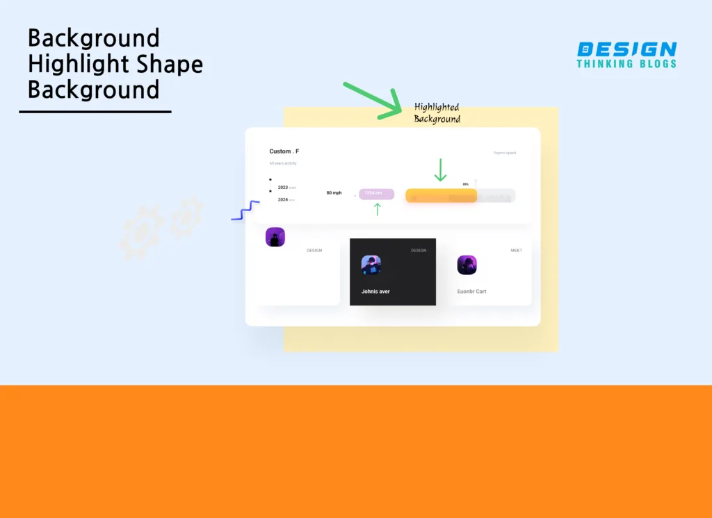
In UI/UX design, the concept of “Background Highlight Shape” is not commonly used, as it is not a specific technique or term in this field. To make a user interface stand out, there are numerous design approaches and techniques to emphasize a background. One technique for creating a highlighted background is to use colors. Emphasize certain elements of a page by making them pop out with vibrant or distinct colors. For instance, to make it clear which action users should take, the call-to-action button could be surrounded by a bright background. Another technique for creating a highlighted background is to use texture or pattern. A textured or patterned background can create visual interest and draw attention to a specific section of a page. For example, a website selling handmade products might use a textured background with a repeating pattern of the company’s logo. In addition to colors and texture, designers can also use typography and white space to create a highlighted background. By using large or bold typography, designers can create a sense of hierarchy and emphasize important information. White space can be used to create a sense of contrast and help important elements stand out.
In summary, “Background Highlight Shape” is not a definite component in the field of UI/UX design, yet numerous design elements and practices can be employed to generate a featured or prioritized backdrop in a user interface with aesthetics Also its follows Shadow Techniques.
Icons are an essential element of modern design, used to represent various concepts and ideas in a concise and recognizable manner. As digital interfaces increasingly utilize icons, creating one that stands out from the competition can be a formidable task. One way to make an icon more visually appealing is to add a highlight shape background. A highlight shape background is a design technique that adds a semi-transparent shape behind an icon, creating a visual effect that makes the icon appear to pop out from the background. The highlight shape background is usually a gradient fill that gradually fades from a lighter to a darker shade of the background color, creating the illusion of depth and dimensionality. To create an icon with a highlight shape background, designers need to start with a simple and clear icon design. The icon should be easily recognizable and convey the intended message or concept. Once the icon design is finalized, designers can choose a color palette for the highlight shape background that contrasts with the icon color. The next step is to create a new layer on top of the icon layer and draw the highlight shape using the pen tool or shape tool. The highlight shape should be slightly larger than the icon to create a margin between the icon and the background. After drawing the highlight shape, designers can apply a gradient fill to the layer, going from a lighter shade of the background color to a darker shade. The gradient fill creates a smooth transition between the highlight shape and the background, making the highlight shape appear more natural. Designers can adjust the opacity of the highlight shape layer to achieve the desired effect. They can also apply a blur or drop shadow effect to make the highlight shape more pronounced.
In conclusion, adding a highlight shape background to an icon is an effective way to create a more visually appealing design. By following these steps, designers can create icons that stand out from the rest and effectively communicate their intended message or concept. Remember to keep the icon design simple and clear and choose a color palette that complements the background color.

Using subtle patterns as a background is a popular design technique that can add depth, texture, and visual interest to a design. Unlike solid color backgrounds, subtle patterns can create a more dynamic and engaging visual experience without being distracting or overwhelming. Subtle patterns can be used in a variety of design contexts, from website backgrounds to print materials such as business cards or brochures. When choosing a subtle pattern for your background, it’s essential to consider the overall design aesthetic and the intended audience. The pattern should complement the design and not clash with any other elements. Some popular subtle patterns include diagonal lines, polka dots, stripes, and textures such as paper or fabric. These patterns can be created using graphic design software or sourced from online pattern libraries. When using subtle patterns as a background, it’s important to consider contrast and legibility. If using a pattern with a light color, the text or other design elements should be a darker color for legibility. Conversely, if the pattern has a darker color, the text or other design elements should be a lighter color to ensure contrast. It’s also crucial to balance the visual weight of the pattern with the rest of the design elements. The pattern should not be too busy or visually overwhelming, as it can distract from the primary message or purpose of the design.
In conclusion, using subtle patterns as a background is a great way to add visual interest and texture to a design without being distracting. When choosing a subtle pattern, consider the overall design aesthetic, the intended audience, and the legibility and contrast of the design elements. By following these guidelines, you can create a design with a subtle pattern background that is both visually engaging and effective in conveying your message or purpose

Using subtle lines as a background is a design technique that adds a touch of elegance and sophistication to a design without being too distracting. Utilizing lines in art is an effective way to lend more dimension and add visual intrigue. By combining lines with other elements such as color, shapes, and textures, a myriad of design aesthetics can be achieved. Backgrounds can be enhanced through various types of lines, ranging from linear, curved, and diagonal to undulating. The thickness, spacing, and color of the lines can also be adjusted to create different effects. When choosing a subtle line background, it’s important to consider the overall design aesthetic and the intended audience. By using delicate and subtle lines, an air of femininity and sophistication can be attained, while more prominent and thick lines evoke a contemporary and striking atmosphere. To create a subtle line background, designers can use graphic design software to create lines of different sizes, shapes, and colors. They can also use pre-made line patterns or textures available in design software or online pattern libraries. When using subtle lines as a background, designers need to ensure that the lines don’t overpower the rest of the design elements. The lines should be subtle and understated, creating a textured background that complements the overall design. To achieve a balanced design, designers can also use color and contrast to ensure that the lines are not too distracting. They can use a color palette that complements the lines and ensures that the text or other design elements are easily readable.
In conclusion, using subtle lines as a background is a design technique that can add texture, depth, and visual interest to a design without being too distracting. When choosing a subtle line background, designers should consider the overall design aesthetic and the intended audience, and ensure that the lines are understated and complement the other design elements. By following these guidelines, designers can create a design with a subtle line background that is elegant, sophisticated, and effective in conveying its message or purpose.

Using large text as the background for a website or design can create a powerful visual impact and convey a bold message to the viewer. In the past few years, the use of big font sizes for the backdrop of designs has become very trendy for valid reasons. The large size and bold font of the text will immediately draw the viewer’s eye and capture their attention. This can be especially useful for websites or designs that want to make a strong first impression or promote a specific message. Secondly, using large text as the background can create a unique visual experience. Instead of relying on traditional background images or patterns, the large text can become the main focal point of the design. This can make a website or design stand out from others and create a memorable experience for the viewer. Thirdly, large text as the background can be an effective way to convey a message or communicate important information. By using large text, designers can emphasize specific words or phrases and ensure that they are noticed by the viewer. Websites or designs that are meant to accentuate a specific commodity feature, product, or service or deliver a particular design intent to users can find this beneficial. Lastly, using large text as the background can create a minimalist design aesthetic. By relying on just one element – the large text – as the main feature of the design, designers can create a clean and simple visual experience for the viewer. This can be especially useful for websites or designs that want to prioritize the content or message over flashy graphics or images.
In conclusion, using large text as the background can be an effective design choice for websites and designs. getting the attention of the user with this background design, an impressive visual experience is created that communicates a meaningful message in a minimalist style. However, it is important to use this design trend thoughtfully and appropriately, as using large text for the background design may not be suitable for all types of websites or designs. designers also take have a look on Latest Facts on Background Design which involves basic graphic elements.
Generally, white backgrounds are used in every website and mobile application white color provides a clutter-free Ui design for your projects. we can use a white background design for user convenience because of white space user engagement increases also few drawbacks are sometimes it looks so simple design it depends on clients’ needs.

Commonly glitter backgrounds used in e-commerce web & applications products promotion section, designers use UI design with glitter backgrounds for the emphasis of recent offers and rewards. glitter background gets the fast attention of users great for achieving calls to action of marketing strategies it also has a drawback it doesn’t fit in all layouts.

in uiux border backgrounds are defined as the boundary of designs and are normally it’s used in the creation of calls to action buttons, enclosed images frames, and stroked icons, these are visual elements in UI design users are looking for these aspects in desired websites and mobile applications, sometimes users feel bordered background more boxy it’s a little con of this background designs.
rainbow background means multi-color background design the best example is weather websites and mobile application they have lots of colors in layouts backgrounds but recently lots of users’ research strategies proves we design two colors of weather website UI designs. Also, few art-related websites use rainbows on their sites it’s more like a resemblance kind of thing some brands relate their identity with rainbows. Also, it has drawn back is limited for the targeted audience that the reasons reach is short of this background design.

in UI design many companies use pink background color layouts on the web & applications, mostly people denote pink color with femineity but it’s a stereotype we use any color for our brand, pink background, and its gradients are provided a great look and feel on the website. The only con is to we need to balance specific gradients on designs.

it’s according to the name- aesthetics, in background design we see every aspect of the look and feel, which means we take aesthetics in the frame. any best suitable background design is known as aesthetic background.

the blue color is linked with stability, calmness, freedom, inspiration, trust, and sophistication, and its use in the web & apps with these aspects. this color background is mainly seen in corporate s ectors. UI designers have great attraction and love for blue backgrounds and users also easily relate to this background design.

The black background is used in many good brands one of our well-known brands Adidas. black is a natural observer mostly in the navigation design of a website black color is used it can vary according to your user’s research data. website footer and topmost header give the best results. black color background denotes the boldness of your designs.
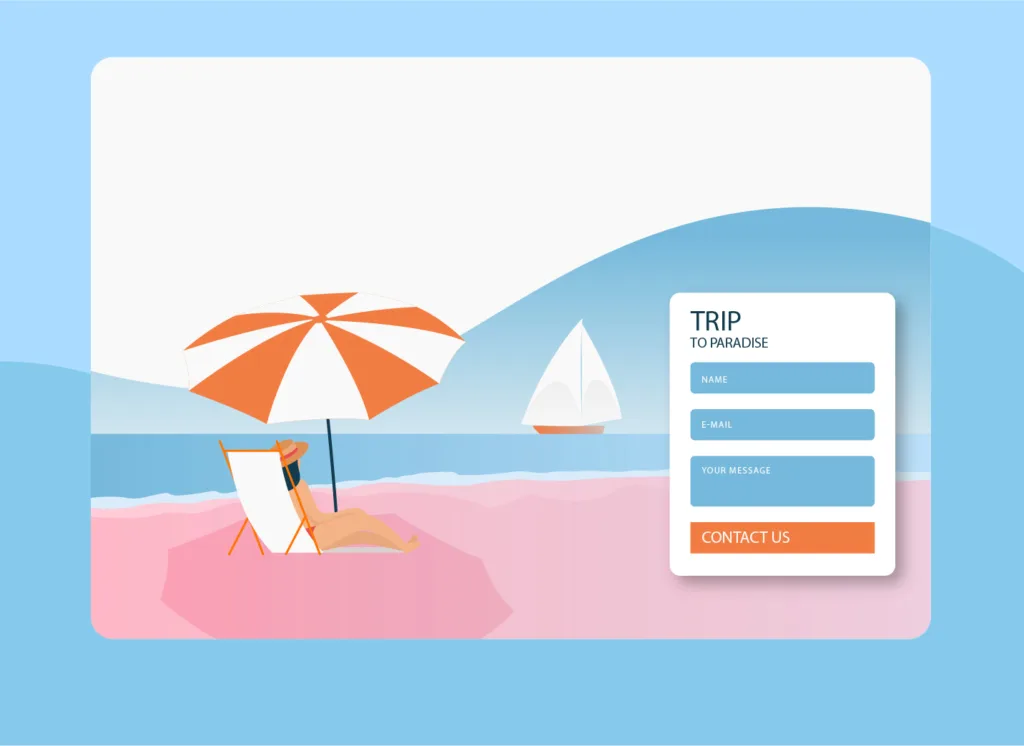
some of the UI design concepts are based on travel, tours, and exotic hotels they used beach background design in landing pages also the colors of beaches are very good for ui gradients color pallets and its visuals representation of thrill life so using on the tours landing page is beneficial for the company and targeted users also.

In Ui design, the technology-based design uses various tech visual elements and waves mostly software companies use these background designs on home pages or landing pages.
The background design is dependent on various factors Already we know in this Article, the best technique to make UI designs attractive as well as serve the purpose of design with the respective user’s experience also according to the call to action (CTA). Making the background using many techniques and experiments by the user experience strategy allows the design, and industry capable because we use any website and application, we see design aesthetics all over look and feel, few techniques we discussed besides this lots of factors we understand in our next article.


Leave A Comment