In this article, I am sharing 5 Shadow Techniques Spice up Your UI Designs. In UIUX design shadow is a very important part it creates depth in any design and makes UI elements more attractive and living, shadows are performed a crucial role in designing a website and mobile Applications. Most UI Designers and Developers conduct individual UX strategies for the right Placement and creation of shadows, there are mainly 5 types of shadow Techniques Floating, solid, outline, Pattern, and Half Shadow Techniques Let us know in detail about these techniques.

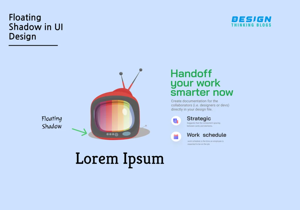
Floating shadow is a design approach used in User Interface (UI) design to give components on a page depth, dimension, and visual intrigue. It adds a shadow beneath an element to make it appear to float above the screen’s surface, giving it a 3D look. Here is an overview of the meaning, benefits, and application of floating shadow in user interface design:
Meaning: Floating shadow is a subtle and adaptable effect that may be utilized to create a wide range of design styles. It gives elements on a page depth and dimension, making them stand out and appear more prominent.
Floating shadow provides various advantages in UI design, including:
Floating shadow can be utilized to give a sense of hierarchy, which improves usability. Floating shadow can be used on a variety of UI elements such as buttons, icons, photos, cards, and more. It is often put beneath the element, with the size and opacity of the shadow modified to achieve the desired effect. The color of the shadow can also be changed to match the design style, with deeper tones giving a more dramatic effect. The darker tones create a dramatic impact, while the lighter shades create a gentler look.
Overall, the floating shadow is a powerful design method that can improve a UI design’s usability, aesthetics, and overall quality. It is possible to make UI elements more engaging and visually appealing to users by adding depth and dimension to them.
Apart from this technique, you should take a look at

Drop shadows need not be blurred. You can have a “shadow” that is an offset shape of the same size as the container. The colored shapes behind these product tiers help to reinforce their differences and make the whole section feel more exciting. Another benefit of using solid shadows in UI design is that they can help to make interfaces more intuitive and easier to use. This can be particularly useful in complex interfaces where there are many different elements and interactions to manage.
A solid shadow can be used in UI design to add depth and dimension to things on a screen. A solid shadow is made by placing a darker version of the element behind it, making it appear to float above the background. It is critical to consider the size, color, and opacity of a solid shadow while employing it. It’s worth mentioning that, while solid shadows can give a wonderful touch to a design, they can also be distracting. unnecessary and Overuse of shadows can make a design appear heavy and congested, so when using shadows, keep the overall balance and harmony of the design in mind.

This is Similar to the previous technique but with the offset outline of the “sign-up” button Background that functions as a shadow. Outline shadow is a design technique used in User Interface (UI) design to give items on a page depth and visual interest. It is a subtle and adaptable effect that may be utilized to produce a wide range of design styles. Here’s a look at how outline shadow is utilized in UI design:
Outline shadow is a thin, colored line that runs around the edge of a piece, producing the appearance of depth and distinguishing it from the background. around the buttons graphic element on a website design is used as Outline shadows, It is normally applied to the element’s outside edge, but it can also be applied to the element’s inside edge to create a border. distinct effect.
Size: The size of the outline shadow can be adjusted to achieve the desired appearance. A thin, subtle line can provide depth, whereas a broader line can generate a bolder, more dramatic impact.
Color: The outline shadow’s color can also be changed to match the design style. To achieve a subtle impact, choose a darker shade of the element’s color, or use a contrasting color to make the piece stand out more.
Outline shadow effects can be utilized in UI design in a variety of ways, including Inner Shadow, Outer Shadow, Multiple Shadows, and Long Shadow. In general, an outline Shadow is a simple but powerful technique for improving UI design by giving depth and visual aesthetics and isolating items from the background.

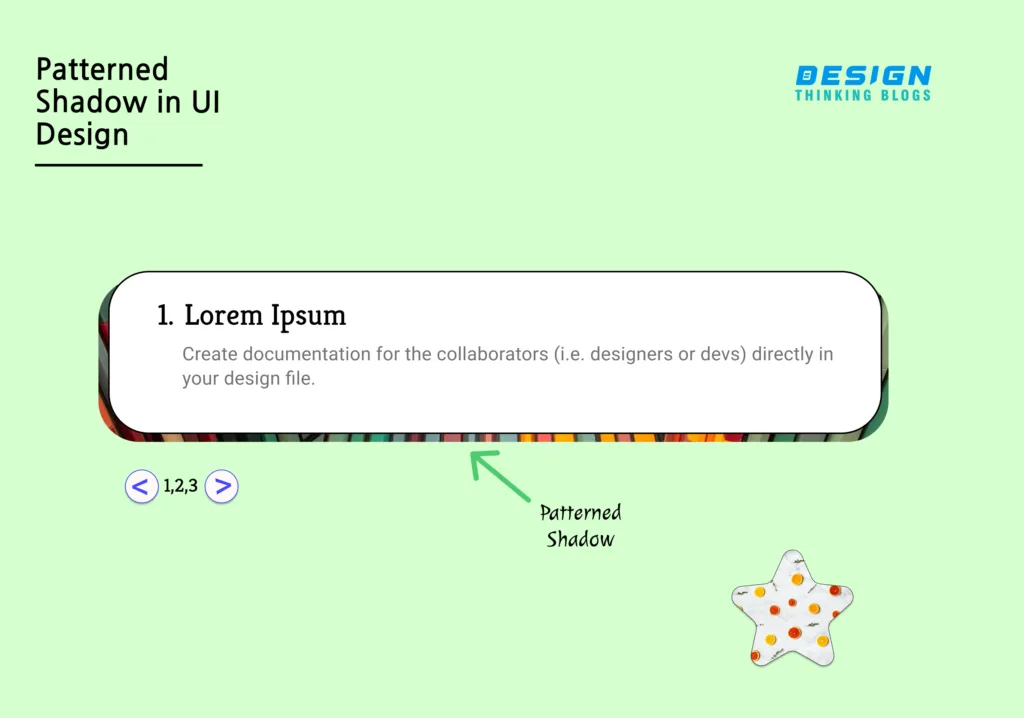
In this method Drop shadows can be created in a variety of patterns. A patterned shadow is a visual effect that is used in the user interface to generate a sense of depth and accuracy. It is a shadow that appears behind an object as a pattern or texture, giving the impression that the object is elevated above the background. Typically, pattern shadows are created using a combination of techniques such as layering, textures, and opacity. Designers can generate a patterned shadow behind an object by layering numerous instances of the same object and altering the opacity of each layer. Interfaces can look more polished and professional by adding depth and dimension. Pattern shadows in UI design have advantages for UI designers, and they may easily make it user-friendly by making interfaces more intuitive and easier to use. This is especially useful in complex interfaces with several elements and interactions to manage. Designers can generate a patterned shadow that appears behind the object by combining layering, textures, and opacity, making interfaces more aesthetically appealing and easier to use. As a result, pattern shadows are a must-have for any UI designer trying to develop interesting and effective interfaces.
This Pattern Shadow technique creates Motif Patterns in UI Design. If you want you know more about Motif Design,
In UI design, a half shadow is a visual effect used to create UI design more sensible also It is a shadow that appears as a gradient or partial shadow, covering only a portion of an object, creating the illusion that the object is partially elevated above the background. Half shadows are a popular design technique in modern UI design it helps in design aesthetics in the UIUX design industry also this industry is new in trends. this shadow technique is created by using a combination of UI Elements, such as layering, gradients, blur, and opacity. By layering multiple instances of the same object and adjusting the opacity of each layer, designers can create a partial shadow that appears on one side of the object. One of the benefits of using half shadows in UI design is that they can help to make interfaces more visually appealing. By creating a sense of depth and dimensionality, interfaces can look more polished and professional. It caters to a wide range of users and provides depth in design Another benefit of using half shadows in UI design is that they can help to make interfaces more intuitive and easier to use. this is designed to be well-connected with users. This can be particularly useful in complex interfaces where there are many different elements and interactions to manage.
half shadows are a popular design technique in modern UI design that creates a Visual Appealing element with design Combinations of layering, gradients, and opacity, UI developers and designers can create a half shadow for better communication of the website to the targeted users, half shadows are an essential tool for any UI designer looking to create engaging and effective interfaces.
Shadow techniques are a very essential factor in modern UI design, as they play a crucial role in creating a sense of depth, dimensionality, and visual appeal in UI Designs. By using shadows, designers can make objects in the interface appear as if they are elevated above the background, creating a sense of hierarchy and structure. and make interfaces are user friendly shadow techniques can help to create a more polished and professional appearance for interfaces, making them more visually appealing and engaging for users. By using a combination of shadow techniques, such as solid, outline, pattern, or half shadows, designers can create interfaces that look modern, sleek, and sophisticated. Additionally, you can use shadow techniques to draw attention to important interface components like buttons, icons, or text. shadows make UI more interactive for Users. Overall, shadow techniques have become an important factor in modern UI design, as they can greatly enhance the usability, visual appeal, and engagement of interfaces. in the era of responsiveness, shadow techniques play an important role and create a revolution in UI Design.
If you found this Article helpful, share with Your friends and colleagues. Also, drop any suggestions in the comment section of how you achieve great shadows and other techniques you applied in your UI Designs.
Leave A Comment